By Joseph Jeffery
Project as Metaphor
Projects like the newly published Foundations for School Library Learning Commons in Canada: A Framework for Success don’t come together overnight. They are developed over months with back and forth, give and take as a collaborative vision coalesces. The team for this project Anita Brooks Kirkland, Carol Koechlin, Lila Armstrong, Judith Sykes, Melanie Mulcaster and myself met frequently over several months via Zoom. We were working across three provinces (Ontario, Alberta and BC) utilizing Google Docs to collaboratively create and iterate on ideas.
From the start of the project there were two main goals. The first was to provide an update to the beloved, but outdated Achieving Information Literacy: Standards for School Library Programs in Canada’s appendices. The second was to act as a co-document to Leading Learning: Standards of Practice for School Library Learning Commons in Canada, not a replacement.
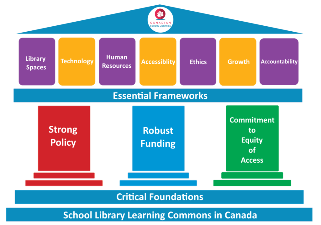
We quickly came up with the idea of foundations and frameworks. Three critical foundations on which school library learning commons in Canada are built, and seven frameworks for successful implementation. This resulted in the first draft of the graphic incorporating these elements as a stoic looking town-hall style building with a clocktower. This represented the metaphor of the foundations and frameworks holding things together. The colours were chosen to match the five colours of Leading Learning.
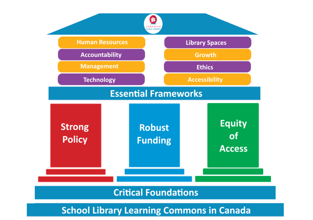
Then we moved to eight frameworks and switched from vertical pills to horizontal. This also was done to balance out the text so that longer frameworks fit nicely. We kept the same colour scheme and general design.
Consistency was important across the CSL ‘brand’ and so to inspire me, I went to Leading Learning and looked at what we had done for that. Each standard had a banner and icon. So, I tried out making a banner that would match the style, but instead of Standards, be for Frameworks. It worked well and we decided to incorporate it.

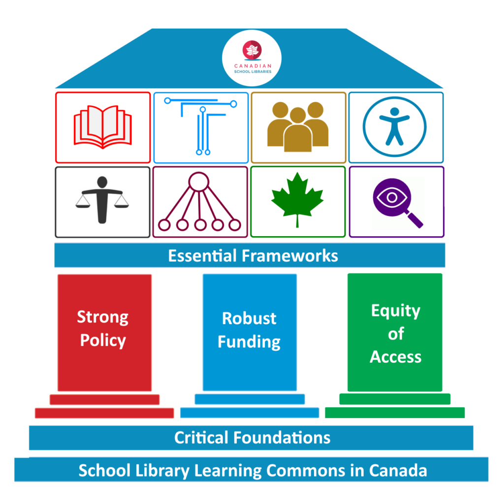
Now that we were using icons, could we incorporate them into our graphic? The next iteration, which was more a proof of concept to lock down our iconography, tried that by using large icons, a hodgepodge of colours and inconsistent styles of icons. While attention was being paid to the weight to try to give consistency, it felt off and also made the graphic far too large.
Knowing When to Pivot
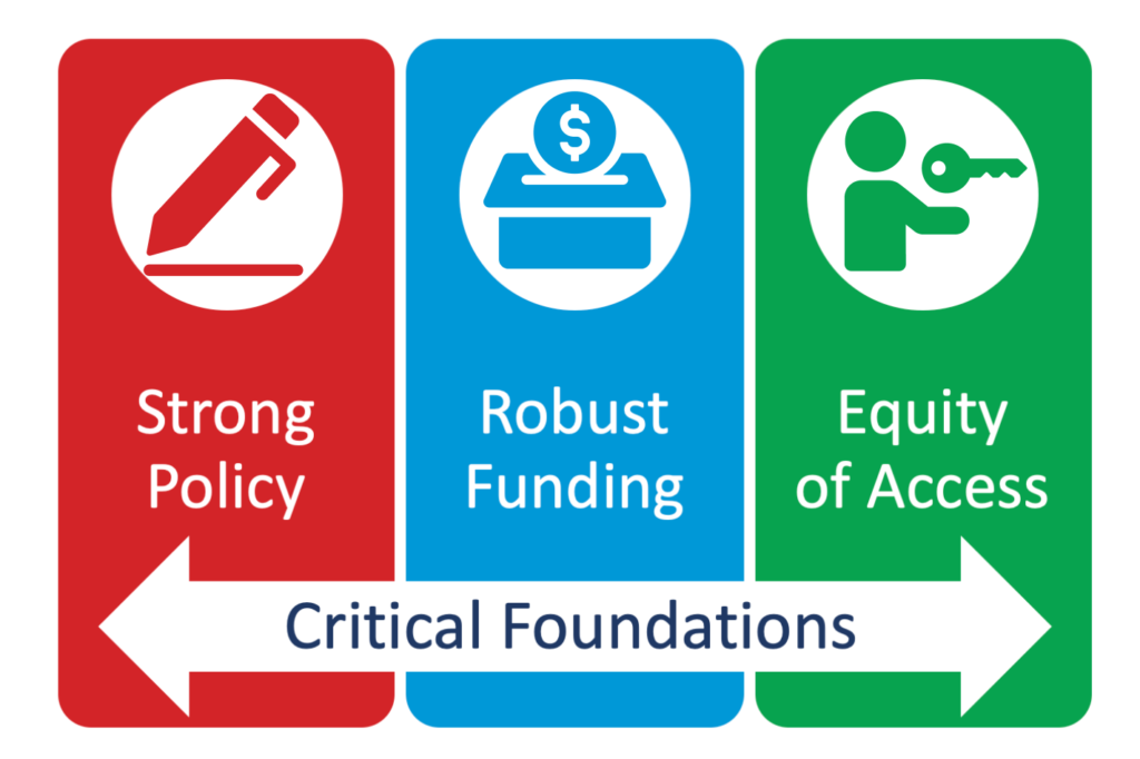
An important aspect of design thinking is knowing when you need to abandon an idea. The conceit at the heart of the graphic was holding us back and forcing us into a structure that wasn’t working. Furthermore, as we worked to decolonize our practice, was it really a great idea to have this very colonial-looking building be the centrepiece of our project? The time had come to abandon our metaphor and examine some alternate approaches. Using Microsoft Word’s Smart Art we looked at some different ways to convey the message, breaking apart the elements to focus on the foundations and the frameworks individually. We liked the use of the banners to mirror Leading Learning and we liked the foundations being represented in some pillar-like way. This led to the next iteration.
Foundations:


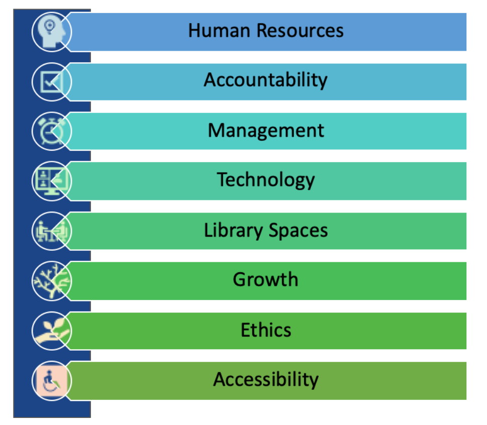
For the frameworks we looked again to smart art to see what it could look like. This utilized icons suggested by Microsoft Word and a gradient of blues and greens.
Frameworks:
Differentiating Elements and Colour Schemes
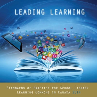
So, what was working? The banner scheme for the frameworks, the rounded pills for the foundations. What wasn’t working? Our iconography and our colour scheme. We also needed to be careful that we were clear about the differences between the foundations and the frameworks. This meant abandoning the banners as icons for the foundations to make sure they were clearly delineated. For our colour scheme we went back once again to Leading Learning. What about using the background colours of our Leading Learning graphic. We had the rights to the image and its component parts for reuse. This led to the next attempt:
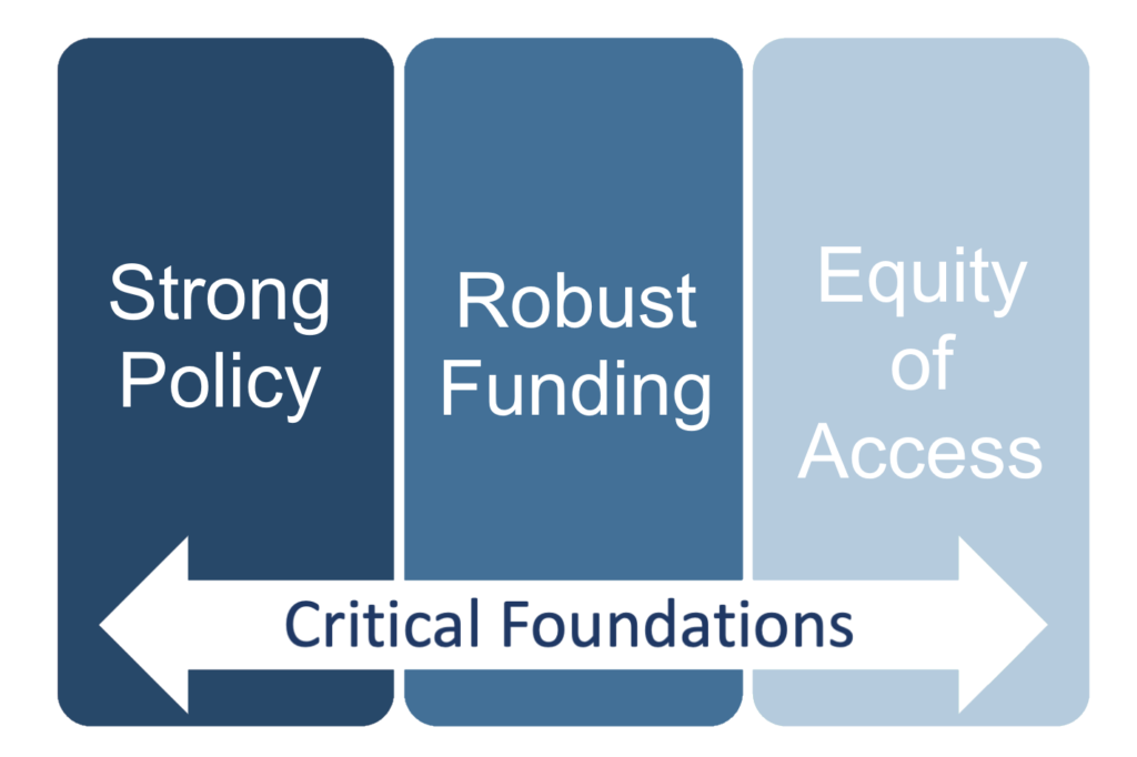
So close but those pills are too big, the colour balance a bit off and the text doesn’t have enough impact. How about this?
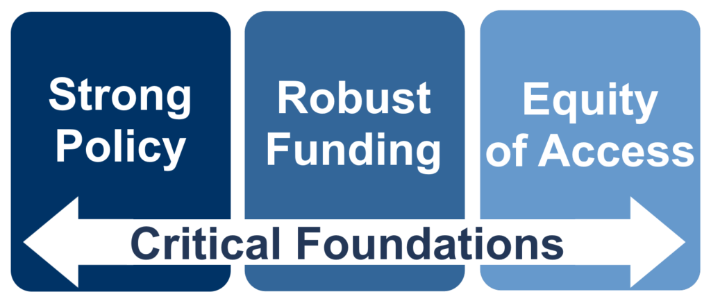
Much better. We had finally got to the right place with this graphic and we were happy with it. It was time to turn to our Frameworks. We had a subscription to The Noun Project which would allow us to find some better icons rather than relying on Google Image search for Creative Commons licensed images. The two icons I had made (technology and management) ended up staying. Using a slideshow we had been sharing graphic ideas, we threw in icons until we found ones that stuck. Using the same blue as the Strong Policy pill the banners turned out well.

Breaking Down the Elements

The banners worked well in the document, but we needed a pithy way to show our frameworks as a group. When we used the building motif it was all pretty well contained. Without that unifying point we had to find another approach to this.
My first attempt at this took an octagon and placed each icon at the vertices. While it looks busy, it looked even busier without the octagon behind. Sharing it to see what people thought a suggestion came back “what if they were in hexagons like a honeycomb”. Using my excellent reading skills, I came up with this.
Each icon in an octagon is placed on the edges of another octagon. Clearly what had been asked.
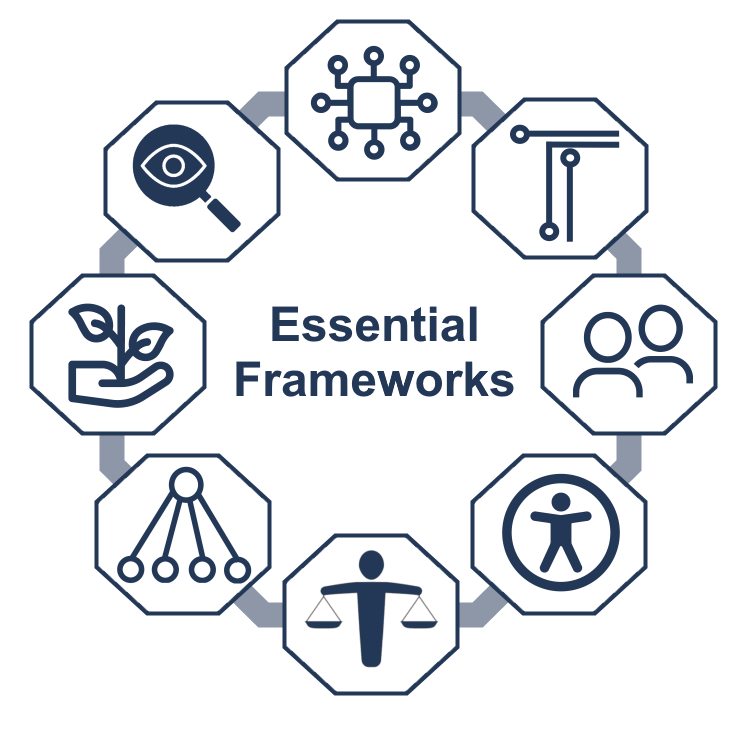
Whoops. How about this? Hexagons, check. Honeycomb, check. Just saying check to myself for remembering to do the thing. You do a good thing, you get a “check”. Learned that one from Monica from Friends.
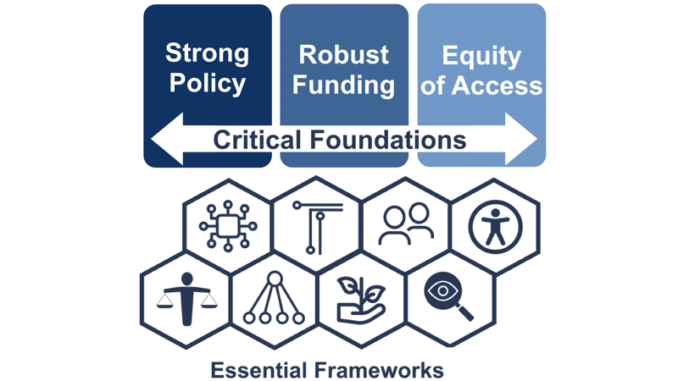
Almost there. This was the right idea, just a little tweak to make it horizontal and we were done.
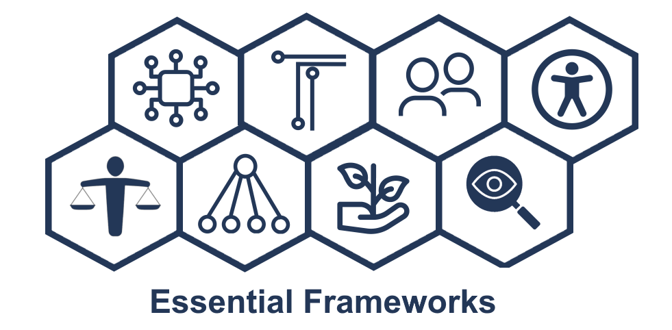
During the back and forth around the graphics, one of the team members said they would just go with what the team wanted “and stop causing you problems” because of all the changes and iterations. My response?
“Feedback and iterative design are never a waste of time.
They’re at the heart of the LLC!!”

Joseph Jeffery is the District Learning Commons Teacher-Librarian for SD57 Prince George, BC. He has been a TL since 2013 at both elementary and high school. He is an immigrant to Canada and is Bangladeshi/English on his mother’s side and Ukrainian/English on his fathers’. He supports teachers and teacher-librarian’s throughout the district in resource selection and acquisitions, e-resources, and all types of literacy. Joseph is the BCTLA’s conference organizer, a lead writer for CSL’s Collection Diversity Toolkit, and a member of the writing team for Foundations for School Library Learning Commons in Canada: A Framework for Success.